Appearance
io.display.grid
Represents a display.grid component.
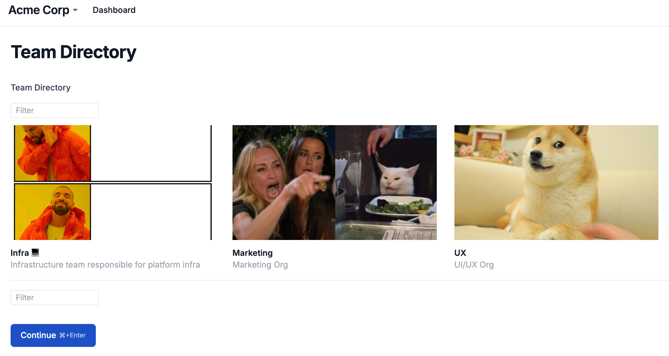
Grid items can include a label, description, image, and options menu, and can optionally link to another page, action, or external URL.
Grid item size can be controlled using the idealColumnWidth property. Forge will calculate a column width that is as close as possible to that number while factoring in gutter size and window width.
Images default to a 16:9 aspect ratio with object-fit set to cover, and can be customized via the image.aspectRatio and image.fit properties respectively in the renderItem callback.
Usage
ts
await io.display.grid("Team Directory", {
  data: [
    {
      label: "Infra 💻",
      description: "Infrastructure team responsible for platform infra",
      imageUrl:
        "https://i.pinimg.com/736x/0f/32/36/0f323612ce814629c56059bb73d7a908.jpg",
    },
    {
      label: "Marketing",
      description: "Marketing Org",
      imageUrl:
        "https://thumbs.dreamstime.com/b/painter-emoticon-14864133.jpg",
    },
    {
      label: "UX",
      description: "UI/UX Org",
      imageUrl:
        "https://encrypted-tbn0.gstatic.com/images?q=tbn:ANd9GcT3cnWV4EI16nCUguZFgFJWyLkI6ewagvK8Ow&s",
    },
  ],
  renderItem: row => ({
    label: row.label,
    description: row.description,
    image: {
      url: row.imageUrl,
      aspectRatio: 1,
    },
  }),
})
python
 def render_item(row):
    return {
        "label": row["label"],
        "description": row["description"],
        "image": {
            "url": row["imageUrl"],
            "aspect_ratio": 1,
        },
    }

value = await io.display.grid(
    "Team Directory",
    data=[
        {
            "label": "Infra 💻",
            "description": "Infrastructure team responsible for platform infra",
            "imageUrl": "https://i.pinimg.com/736x/0f/32/36/0f323612ce814629c56059bb73d7a908.jpg",
        },
        {
            "label": "Marketing",
            "description": "Marketing Org",
            "imageUrl": "https://thumbs.dreamstime.com/b/painter-emoticon-14864133.jpg",
        },
        {
            "label": "UX",
            "description": "UI/UX Org",
            "imageUrl": "https://encrypted-tbn0.gstatic.com/images?q=tbn:ANd9GcT3cnWV4EI16nCUguZFgFJWyLkI6ewagvK8Ow&s",
        },
    ],
    render_item=render_item,
)
Props
data Optional
T[]
Array of data. Values are objects with arbitrary keys/values. Must be specified if getData is not specified.
defaultPageSize Optional
number
The default page size for the paginated table. Pass Infinity to disable pagination by default.
getData Optional
(state) => Promise<{ data: T[], totalRecords?: number }>
An async function that receives the current grid state as its only argument, and returns an array of data and an optional totalRecords count.
getData: (
  state: {
    // the user's search query, may be an empty string
    queryTerm?: string,
    // the number of records to skip for the current
    // `queryTerm` and sorting, for pagination
    offset: number,
    // the current page size, should return at least this
    // many records if available
    pageSize: number
  }
}) => Promise<{
  // the result set for this table state
  data: T[],
  // the total number of records available for this queryTerm, if known
  totalRecords?: number
}>
helpText Optional
string Secondary label providing an additional description of the data. Supports inline markdown elements like bold, italics, and links.
idealColumnWidth Optional
number Used to control grid item sizing. Forge will calculate a column width that is as close to this number as possible while factoring in gutter size and window width.
isFilterable Optional
boolean Whether to show a text input alongside the grid for filtering and searching through items. Forge automatically handles filtering when using data, but you must implement filtering yourself when using getData. See the 'Asynchronous data' example for a code sample. Defaults to true.
renderItem Optional
(row: T) => object Function that receives the row as argument and returns an object to control various components of the display output. See the function definition below for available properties.
renderItem: (row: T) => {
  // the visible item label
  title?: string | number | boolean | Date;
  // an optional description
  description?: string | number | boolean | Date;
  // links the item to an external URL
  url?: string;
  // links the item to another action or page
  route?: string;
  // an image to be displayed in the cell
  image?: {
    // a URL to the image
    url?: string
    // the image alt tag
    alt?: string
    // the image aspect ratio, e.g. `1` or `16 / 9`, defaults to 16 / 9.
    aspectRatio?: number
    // whether the image should be resized to fill its container or
    // be cropped to fit, defaults to 'cover'.
    fit?: 'cover' | 'contain'
  }
  // an array of links to be displayed in a dropdown menu
  menu?: {
    // links to an external URL
    url?: string;
    // links to another page or action
    route?: string;
    // arbitrary key/value pairs to send to the linked route
    params?: Record<string, any>;
    // disables the menu item
    disabled?: boolean
    // the style of the item
    theme?: 'danger' | undefined
  }[]
}